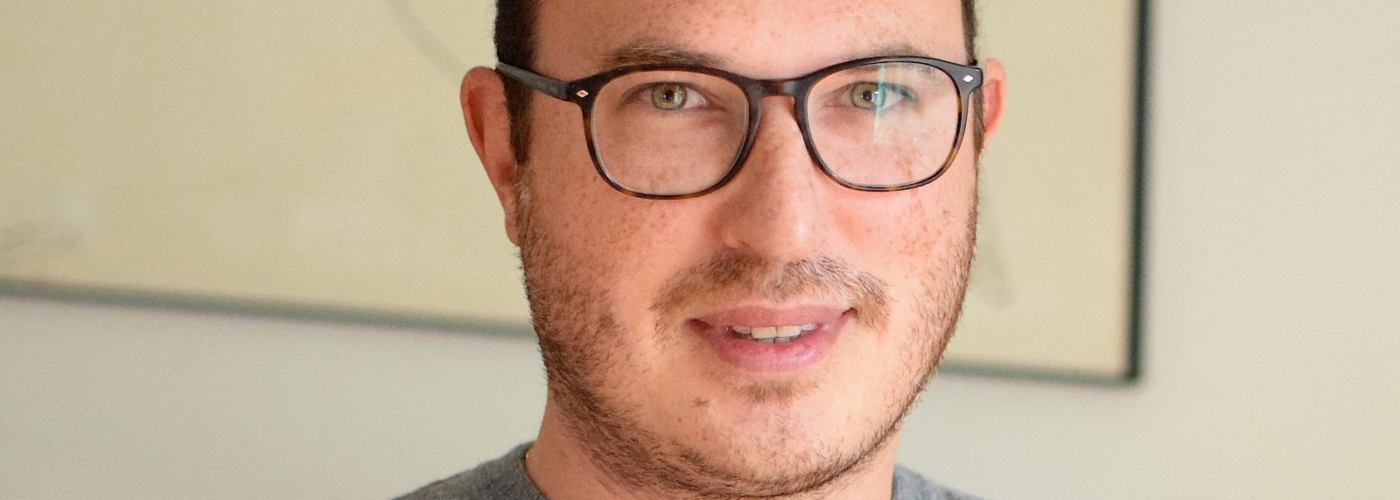
Karim Douieb, data-famished
Article author :

When he is not analysing data packets for his clients, Karim Douieb endeavours to give life to them visually. The Brussels inhabitant is also establishing contacts with data journalism, once again with the aim of giving voice to these data.
When we meet in his Etterbeek office, it is naturally with a diagram that he introduces himself. More than a job-conditioned mannerism, Karim is dyslexic as well. ‘I have great difficulty in expressing myself in words. The visual has always been more intuitive for me.’ His career history however began at the opposite end of the visual spectrum. After gaining a Bachelor’s degree in computer science at the Université Libre de Bruxelles (ULB) twenty years ago, the Brussels based analyst continued into academia with a doctorate, followed by postdoctoral studies which led him to Canada. For years he never defined himself as a creative and didn’t write a single line of code. ‘I was doing conceptual informatics. It was very abstract, but these algorithms still come in useful for me today.’
It was only once he had abandoned research and set up home in London that he laid his hands on data for the first time. ‘I was working for a company which collected a staggering variety of data for advertisers, as a means of checking if the number of views a campaign gets is contractually respected, for example. I very quickly became frustrated by not being able to do much by way of processing these huge volumes of data and the trends I was discovering in them. The marketing aspect of my job gave me no pleasure whatsoever, but it was there I became hooked on the analytical aspect of data and, a little later, on dataviz.’
‘Dataviz grabs the eye and often allows a less informed audience to grasp issues which would be a lot harder to get their head around by using words.’
Karim Douieb
For this, read data visualisation. A discipline which consists of representing qualitative but above all quantitative statistical data by means of graphics. ‘The aim is always to extract the trends within the data packets we comb through and to make them visually accessible to a large audience. Dataviz grabs the eye and often allows a less informed audience to grasp issues which would be a lot harder to get their head around using words.’
If he deplores the scarcity of design or data visualisation option courses in computer science curricula – even fewer when he was a student, he points out – data visualisation remains a sideline in his everyday life. Having returned to the country of his birth, he developed his expertise, got together with four friends every bit as data-crazy as he is, and in 2017 they founded Jetpack.AI. A data analytics company which today has 17 employees working for it. ‘The vast majority of our work involves analytics for very varied organisations such as the Flemish government, the Prime Minister’s Office, or Brussels Airport. It is very rare to sell a pure dataviz project. The visual aspect is always the icing on the cake regarding the data analytics our clients commission from us.’ With a single exception: journalism.
Data X journalism
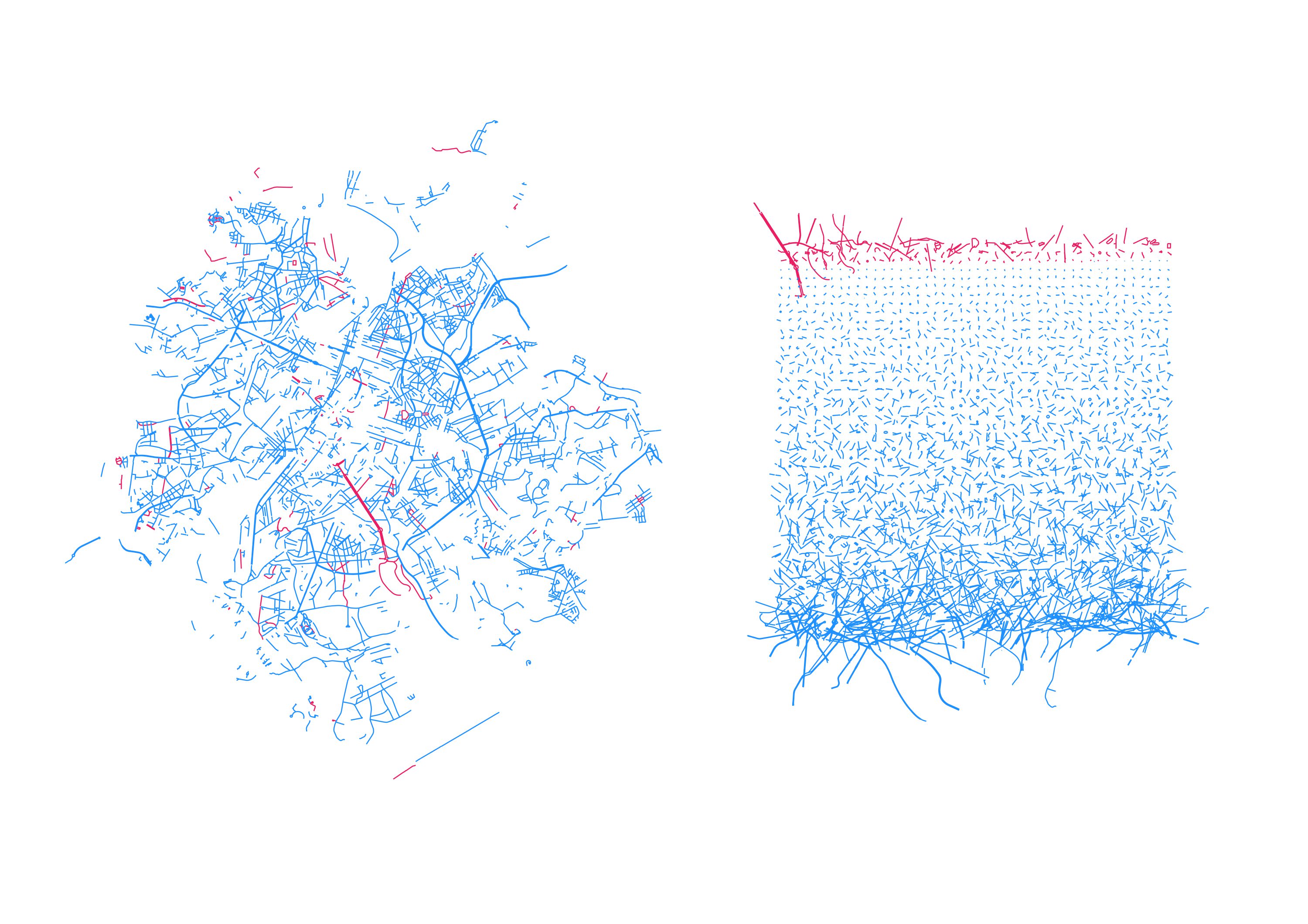
His Cartesian spirit hadn’t imagined becoming involved with the field of journalism, but gradually the data scientist came to people’s notice thanks to his interactive computer graphics. One October evening in 2019, Karim caught sight of a Tweet by Laura Trump, the daughter-in-law of the 45th President of the United States. ‘Try to impeach this,’ she protested, linking her Tweet to a distorted electoral map. ‘The computer graphic represented thousands of square kilometres of land empty of inhabitants supposedly in favour of Trump. I was outraged to see these distorted maps escalating across the social networks. I am not involved in politics, but I wanted to correct this visual error.’
Challenge accepted! Here is a transition between surface area of US counties and their associated population. This arguably provides a much more accurate reading of the situation. @observablehq notebook: https://t.co/wdfMeV5hO4 #HowChartsLie #DataViz #d3js https://t.co/lStHeeuMUw pic.twitter.com/MpYiXtsHmu
— Karim Douïeb (@karim_douieb) October 8, 2019
In a single evening, he got down to the task of coding a new map, closer to the electoral reality. One melodramatic transition between the old and the new version later, Karim posted his map on the blue bird social network and went to bed. ‘In the morning, when I went on Twitter, I had received hundreds of notifications, and my account had gone from 300 to over 10,000 followers. I hadn’t anticipated the impact my map might have.’ Since then, at each key moment of the American elections, this same map crops up in the American and international media. ‘Even on Fox News, even though, ordinarily, the pro-Republican media is quite willing to air approximations.’
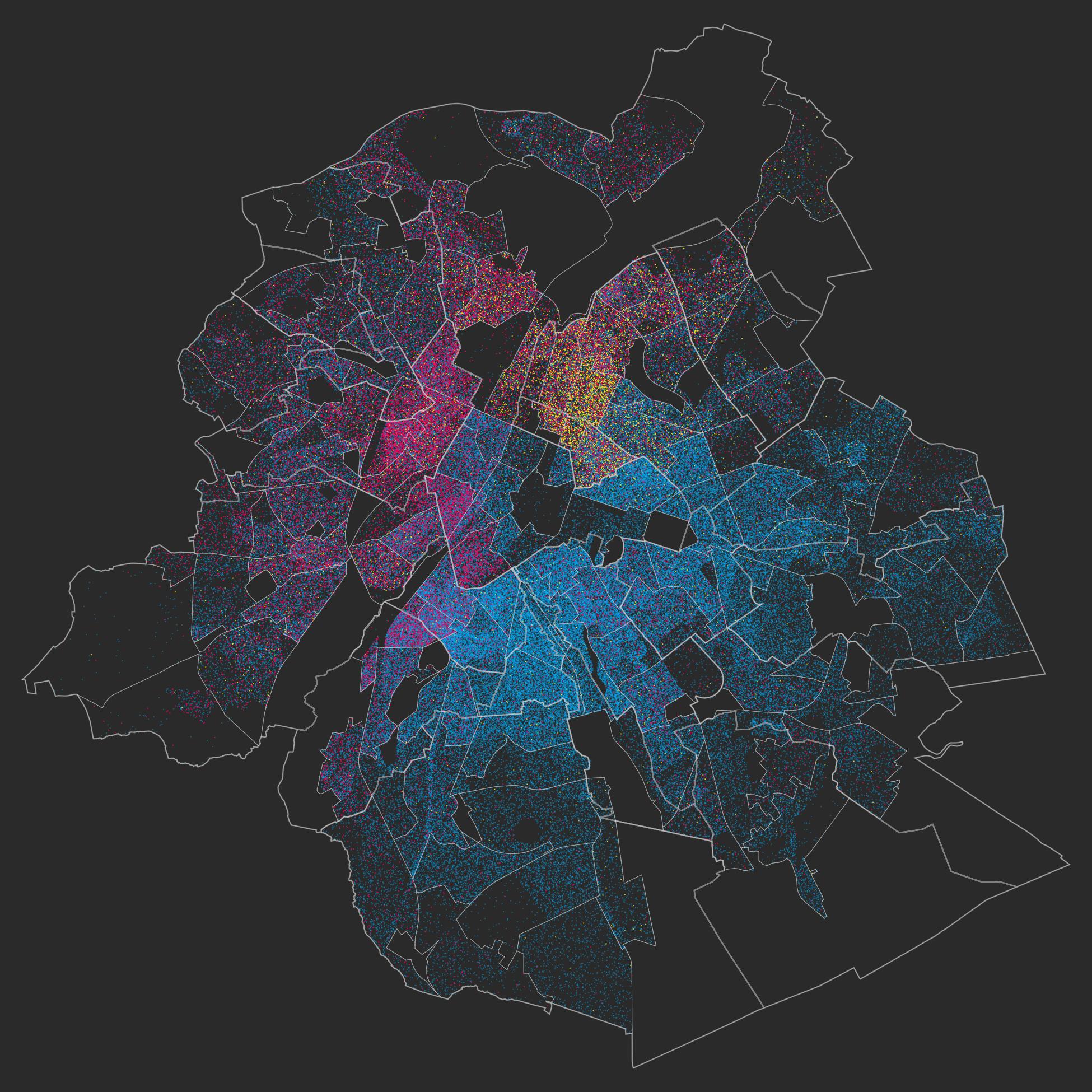
Another one of his maps had a large impact, amongst the Brussels community this time, and is incidentally now on display at the Migration Museum. “With ‘Brussels, a lovely melting-pot,” the goal was to show how unusual our capital is in terms of multiculturalism, but also to shatter the preconceptions of the far-right concerning immigration in Brussels. 60% of Brussels inhabitants are born non-Belgian, but 70% of them are Europeans, for the most part with origins in the EU15 countries.’ This dataviz project caught the eye of journalists involved with the Médor investigative media hub, which immediately contacted Karim for his services.
Today, via Wilfried, Médor, the RTBF, but also the American media CBS News, and to one side of his more “corporate” activity, Karim works with numerous journalists. The majority of them data analysis novices. ‘The relationship I have with journalists always challenges me because often they want to investigate databases I would never have even imagined contained tendencies to be discerned, as well as fraud.’ A growing number of editorial boards are increasingly adding people experienced in data journalism to their teams because the meeting between these two worlds is productive and occasionally allows alarms to be sounded or societal issues to be identified. Nevertheless, Karim is at pains to point out that, economically speaking, it would be difficult to live solely on the basis of working together with the media. The budgets allocated are very insecure.
How do Belgian party presidents use Twitter?
I always have to explain my process, and make my sources available. In that, dataviz and journalism are in the end very similar.
Karim Douieb
Whether it is when he is working with journalists or when he presents data analysis results to an executive committee, Karim insists on the dataviz policy. ‘There is a strong need for transparency. I always have to explain my process, to make my sources available. Everybody should be able to replicate the same data visualisation project. In that, dataviz and journalism are in the end very similar.’
Transparency, rigour in the methodology applied to data, the data guy also insists on the need to maintain a continuing education approach when one gets into data visualisation. ‘In dataviz, you can learn everything by doing it. Even now, for each new project, I try to acquire new skills, ways of visualising the data which I am not yet on top of. It’s a field which is evolving so much. But fortunately, the dataviz enthusiasts on the web are ultra-considerate. You always find help when you are stuck with an idea you don’t know how to implement.’
And his creative brain is not lacking ideas. His latest fad? Data applied to ceramics. ‘I started a course at art school a year ago. I wanted to do something with my hands. For the moment I am getting to grips with the subject, the technical aspect. But in the not too distant future I would love to bring the world of data together with my work with clay with pieces called “data physicalisation”, making data tangible.’
My ceramic reinterpretation of the “bandwidth of the senses” concept. If the volume of this cube is the amount of information your brain can process. Your sight would be the fastest sense, followed by your touch, smell, hearing and taste. The tiny cube is what you are aware of. pic.twitter.com/xB1vgUkp49
— Karim Douïeb (@karim_douieb) May 1, 2022
Ceramic polycon. It’s a kind of developable roller, i.e. while rolling on a plane it develops its entire surface so that all the points on the surface touch the rolling plane.
— Karim Douïeb (@karim_douieb) March 30, 2022
Check out this thread to see how I’ve made it: pic.twitter.com/Dn8cWJxxuV
A story, projects or an idea to share?
Suggest your content on kingkong.
also discover
Go with the flow of digital creativity, The Greater Creative Region is on the move!
From Belgium to Japan, the new territories of creative digital creativity
Stereopsia, the key European immersive technologies hub